Базові компоненти React Native
Базові компоненти React Native
Навіщо ця стаття
У попередніх матеріалах уже з’явилися Screen, AppText і Button. Під капотом вони зібрані з базових компонентів React Native. Тут ці «цеглини» розбираються окремо: що робить кожна, чим відрізняється від HTML, які типові помилки роблять люди з web-досвідом.
Після статті:
- Зрозуміло, навіщо
Viewі чому текст лише вText. - Як показати зображення (
Image). - Як реагувати на натискання (
Pressable). - Коли потрібен
ScrollView, а коли ще рано (списки — окрема стаття). - Що таке safe area і навіщо
Platform. - У Nomad — mock-картки поїздок на домашньому екрані.
div, span, img, button). У React Native різні ролі розділені на різні компоненти: контейнер (View), текст (Text), картинка (Image), зона натискання (Pressable). Змішати ролі «як у HTML» часто не виходить або дає попередження.::react-native-preview — рендер через react-native-web у рамці телефону. Це не симулятор iOS/Android: layout і core-компоненти близькі до нативу, але тіні, шрифти й native modules можуть відрізнятися. У прев’ю доступні лише react і react-native (без @/…, expo-*, Router).Місток з web React
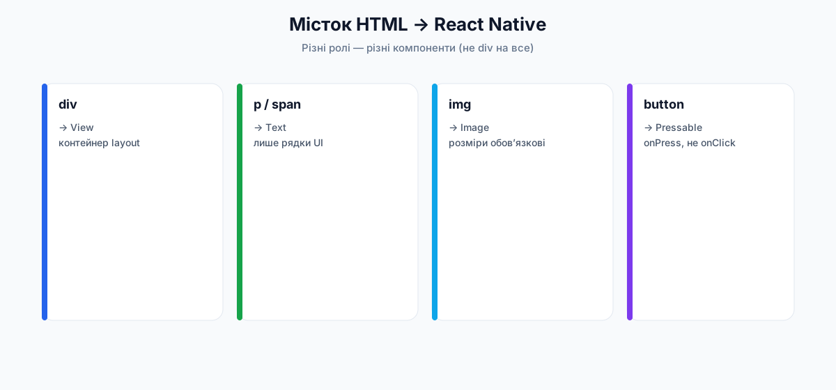
| У браузері | У React Native | Коментар |
|---|---|---|
div, section, main | View | Контейнер для layout, без тексту всередині «просто рядком» |
p, span, h1… | Text | Усі видимі рядки для користувача |
img | Image | Потрібні розміри / стиль; джерело — локальний файл або URI |
button, div onClick | Pressable (або старі Touchable*) | onPress, не onClick |
| прокрутка сторінки | ScrollView / списки | Довгий контент не «їде» сам, як document |
CSS cursor, hover | майже немає | Телефон — дотик, не миша |
{title} або 'Привіт'безпосередньо всередині View. У React Native рядок для UI має бути обгорнутий у Text (або в ваш AppText, який всередині використовує Text).View — контейнер layout
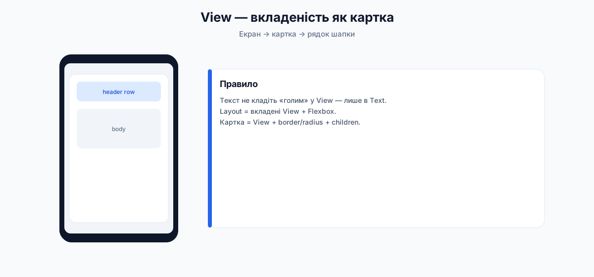
Офіційна ідея з документації View: View — найфундаментальніший компонент UI. Це контейнер, який підтримує:
- layout (у React Native — переважно Flexbox);
- style (фон, відступи, межі, прозорість…);
- частину обробки дотиків (responder-система; для кнопок у курсі беремо
Pressable); - accessibility (підказки для скрінрідера).
На нативній стороні View відповідає «рідному» контейнеру платформи (UIView на iOS, android.view.View на Android тощо). Компонент розрахований на вкладеність: у нього може бути від 0 до багатьох вкладених елементів будь-якого типу (інші View, Text, Image…).
View через StyleSheet (ясність і дисципліна). Inline-стилі теж працюють, але в проєктах курсу — StyleSheet.create + tokens.Мінімальний приклад
Зовнішній View — рядок; внутрішні — кольорові квадрати; текст — окремий Text, не «рядок у View».
Loading…
react-native-web · not a real device
import { View, Text, StyleSheet, useColorScheme } from 'react-native';

export default function App() {
  const scheme = useColorScheme();
  const isDark = scheme === 'dark';

  return (
    <View style={[styles.screen, isDark && { backgroundColor: '#000' }]}>
      <View style={styles.row}>
        <View style={[styles.box, { backgroundColor: '#2563EB' }]} />
        <View style={[styles.box, { backgroundColor: '#16A34A' }]} />
        <View style={[styles.box, { backgroundColor: '#DC2626' }]} />
        <Text style={{ color: isDark ? '#f5f5f7' : '#0f172a', fontSize: 16 }}>Підпис поруч</Text>
      </View>
      <Text style={[styles.hint, { color: isDark ? '#a1a1aa' : '#64748b' }]}>
        flexDirection: 'row' · gap: 8 · вкладені View
      </Text>
    </View>
  );
}

const styles = StyleSheet.create({
  screen: {
    flex: 1,
    justifyContent: 'center',
    backgroundColor: '#F8FAFC',
    padding: 24,
    gap: 16,
  },
  row: {
    flexDirection: 'row',
    alignItems: 'center',
    padding: 16,
    gap: 8,
    backgroundColor: 'rgba(37, 99, 235, 0.08)',
    borderRadius: 12,
  },
  box: {
    width: 40,
    height: 40,
    borderRadius: 8,
  },
  hint: {
    fontSize: 13,
  },
});
Вкладеність: колонка, картка, «шапка»
View майже завжди гніздиться. Нижче — типова схема екрана: корінь → картка → шапка (рядок) + тіло.
Loading…
react-native-web · not a real device
import { View, Text, StyleSheet, useColorScheme } from 'react-native';

export default function App() {
  const scheme = useColorScheme();
  const isDark = scheme === 'dark';
  const text = isDark ? '#f5f5f7' : '#0f172a';
  const muted = isDark ? '#a1a1aa' : '#64748b';
  const surface = isDark ? '#1c1c1e' : '#fff';
  const border = isDark ? '#3a3a3c' : '#e2e8f0';

  return (
    <View style={[styles.screen, isDark && { backgroundColor: '#000' }]}>
      <View style={[styles.card, { backgroundColor: surface, borderColor: border }]}>
        <View style={styles.header}>
          <View style={styles.dot} />
          <Text style={[styles.title, { color: text }]}>Картка поїздки</Text>
        </View>
        <Text style={[styles.body, { color: muted }]}>
          Зовнішній View задає відступи екрана. Внутрішній — білу «картку». Ще один View у шапці
          тримає крапку й заголовок в один рядок.
        </Text>
      </View>
    </View>
  );
}

const styles = StyleSheet.create({
  screen: {
    flex: 1,
    backgroundColor: '#F8FAFC',
    padding: 20,
    justifyContent: 'center',
  },
  card: {
    borderRadius: 16,
    borderWidth: 1,
    padding: 16,
    gap: 12,
  },
  header: {
    flexDirection: 'row',
    alignItems: 'center',
    gap: 10,
  },
  dot: {
    width: 12,
    height: 12,
    borderRadius: 6,
    backgroundColor: '#2563EB',
  },
  title: {
    fontSize: 18,
    fontWeight: '700',
  },
  body: {
    fontSize: 15,
    lineHeight: 22,
  },
});
Важливі props (не весь довідник)
Документація View містить довгий список props (accessibility, focus, responder…). Нижче — те, що реально потрібно на старті курсу.
[styles.base, condition && styles.active]).View бути ціллю дотику.auto — так; none — ні (і вкладені елементи теж «прозорі» для дотику в класичному сенсі); box-none — сам View не ловить, вкладені елементи можуть; box-only — ловить лише «коробка», вкладені — ні. Корисно для оверлеїв і «дірявих» шарів.event.nativeEvent.layout — { x, y, width, height }. Зручно, коли треба виміряти блок (рідко на перших екранах).testID / nativeIDвимикають оптимізацію «layout-only view removal».collapsable={false} залишає вузол, якщо він потрібен для вимірювань/рефів. За замовчуванням оптимізація увімкнена.button, header, image…). Повний прохід a11y — окрема стаття; звичка ставити label на інтерактив — уже зараз.Playground: як style-пропси змінюють View
Більшість «зовнішності» View задається не окремими HTML-атрибутами, а полем style. Нижче перемикайте варіанти — той самий синій блок змінює flexDirection, borderRadius, opacity, padding.
Loading…
react-native-web · not a real device
import { useState } from 'react';
import { View, Text, Pressable, StyleSheet, useColorScheme } from 'react-native';

type Dir = 'column' | 'row';
type Radius = 0 | 8 | 20 | 999;
type Opacity = 1 | 0.5 | 0.2;
type Pad = 4 | 12 | 24;

function Chip({
  label,
  active,
  onPress,
}: {
  label: string;
  active: boolean;
  onPress: () => void;
}) {
  return (
    <Pressable
      onPress={onPress}
      style={[styles.chip, active && styles.chipOn]}
    >
      <Text style={[styles.chipText, active && styles.chipTextOn]}>{label}</Text>
    </Pressable>
  );
}

export default function App() {
  const [dir, setDir] = useState<Dir>('column');
  const [radius, setRadius] = useState<Radius>(8);
  const [opacity, setOpacity] = useState<Opacity>(1);
  const [pad, setPad] = useState<Pad>(12);
  const scheme = useColorScheme();
  const isDark = scheme === 'dark';
  const text = isDark ? '#f5f5f7' : '#0f172a';
  const muted = isDark ? '#a1a1aa' : '#64748b';

  return (
    <View style={[styles.screen, isDark && { backgroundColor: '#000' }]}>
      <Text style={[styles.h, { color: text }]}>View · style playground</Text>

      <Text style={[styles.group, { color: muted }]}>flexDirection</Text>
      <View style={styles.row}>
        <Chip label="column" active={dir === 'column'} onPress={() => setDir('column')} />
        <Chip label="row" active={dir === 'row'} onPress={() => setDir('row')} />
      </View>

      <Text style={[styles.group, { color: muted }]}>borderRadius</Text>
      <View style={styles.row}>
        {([0, 8, 20, 999] as Radius[]).map((r) => (
          <Chip key={r} label={String(r)} active={radius === r} onPress={() => setRadius(r)} />
        ))}
      </View>

      <Text style={[styles.group, { color: muted }]}>opacity</Text>
      <View style={styles.row}>
        {([1, 0.5, 0.2] as Opacity[]).map((o) => (
          <Chip key={o} label={String(o)} active={opacity === o} onPress={() => setOpacity(o)} />
        ))}
      </View>

      <Text style={[styles.group, { color: muted }]}>padding</Text>
      <View style={styles.row}>
        {([4, 12, 24] as Pad[]).map((p) => (
          <Chip key={p} label={`${p}`} active={pad === p} onPress={() => setPad(p)} />
        ))}
      </View>

      <View
        style={[
          styles.demo,
          {
            flexDirection: dir,
            borderRadius: radius,
            opacity,
            padding: pad,
          },
        ]}
      >
        <View style={styles.childA} />
        <View style={styles.childB} />
        <Text style={styles.demoLabel}>A + B</Text>
      </View>

      <Text style={[styles.code, { color: muted }]}>
        {`flexDirection: '${dir}'\nborderRadius: ${radius}\nopacity: ${opacity}\npadding: ${pad}`}
      </Text>
    </View>
  );
}

const styles = StyleSheet.create({
  screen: {
    flex: 1,
    backgroundColor: '#F8FAFC',
    padding: 16,
    gap: 6,
  },
  h: { fontSize: 17, fontWeight: '700', marginBottom: 4 },
  group: { fontSize: 11, fontWeight: '600', marginTop: 6, textTransform: 'uppercase' },
  row: { flexDirection: 'row', flexWrap: 'wrap', gap: 6 },
  chip: {
    paddingHorizontal: 10,
    paddingVertical: 6,
    borderRadius: 8,
    backgroundColor: '#e2e8f0',
  },
  chipOn: { backgroundColor: '#2563EB' },
  chipText: { fontSize: 12, fontWeight: '600', color: '#0f172a' },
  chipTextOn: { color: '#fff' },
  demo: {
    marginTop: 12,
    backgroundColor: '#2563EB',
    minHeight: 100,
    alignItems: 'center',
    justifyContent: 'center',
    gap: 8,
  },
  childA: { width: 36, height: 36, backgroundColor: '#93c5fd', borderRadius: 4 },
  childB: { width: 36, height: 36, backgroundColor: '#fde68a', borderRadius: 4 },
  demoLabel: { color: '#fff', fontWeight: '700', fontSize: 12 },
  code: { marginTop: 8, fontSize: 11, fontFamily: 'monospace', lineHeight: 16 },
});
View — прозора коробка для зберігання: сама нічого не «говорить» користувачу текстом, але тримає форму layout. Усе, що треба прочитати, кладіть у Text. Props на кшталт pointerEvents / testIDне малюють пікселі — вони впливають на дотик і тести. Зовнішність майже завжди = style.onStartShouldSetResponder, onResponderMove…) у docs View описана для низькорівневих жестів. У курсі для кнопок і карток використовуємо Pressable, а не ручний responder на кожному View.Text — відображення тексту
За документацією Text: компонент для показу тексту. Підтримує вкладеність, стилі й навіть обробку натискань на самому тексті.
Головне правило (strict isolation)
У React Native не можна покласти текстовий вузол безпосередньо в View. Лише обгортка Text (або ваш AppText):
// ПОГАНО — runtime error / warning
<View>Привіт</View>

// ДОБРЕ
<View>
  <Text>Привіт</Text>
</View>
Loading…
react-native-web · not a real device
import { View, Text, StyleSheet, useColorScheme } from 'react-native';

export default function App() {
  const scheme = useColorScheme();
  const isDark = scheme === 'dark';

  return (
    <View style={[styles.screen, isDark && { backgroundColor: '#000' }]}>
      <View style={styles.ok}>
        <Text style={styles.okLabel}>ДОБРЕ</Text>
        <Text style={{ color: isDark ? '#f5f5f7' : '#0f172a', fontSize: 18 }}>
          Привіт з Text
        </Text>
      </View>
      <View style={styles.bad}>
        <Text style={styles.badLabel}>ПОГАНО (не робіть так)</Text>
        <Text style={{ color: '#7f1d1d', fontSize: 14, lineHeight: 20 }}>
          {'<View>Привіт</View>'} — рядок без Text → помилка / warning у RN
        </Text>
      </View>
    </View>
  );
}

const styles = StyleSheet.create({
  screen: {
    flex: 1,
    justifyContent: 'center',
    padding: 24,
    gap: 16,
    backgroundColor: '#F8FAFC',
  },
  ok: {
    backgroundColor: '#dcfce7',
    borderRadius: 12,
    padding: 16,
    gap: 8,
  },
  okLabel: {
    fontSize: 12,
    fontWeight: '700',
    color: '#166534',
  },
  bad: {
    backgroundColor: '#fee2e2',
    borderRadius: 12,
    padding: 16,
    gap: 8,
  },
  badLabel: {
    fontSize: 12,
    fontWeight: '700',
    color: '#991b1b',
  },
});
Це навмисно суворіше, ніж CSS inheritance у браузері. Офіційна мотивація (скорочено):
- Ізоляція компонентів — вигляд не повинен «витікати» з батьків через успадкований font, інакше компонент поводиться по-різному в різних місцях.
- Простіша реалізація — не треба тягнути
fontFamilyчерез усе дерево view.
Практичний висновок docs: зробіть свій MyAppText / AppText із базовими стилями й використовуйте його скрізь (саме так у Nomad).
Вкладений текст (nested text)
На iOS/Android форматований рядок (bold + color) — це нативні attributed/spannable strings. У RN обрали веб-парадигму: вкладені <Text>:
<Text style={{ fontWeight: 'bold' }}>
  Я жирний{' '}
  <Text style={{ color: 'red' }}>і червоний</Text>
</Text>
Під капотом це зводиться до одного нативного текстового блоку з діапазонами стилів.
Loading…
react-native-web · not a real device
import { View, Text, StyleSheet, useColorScheme } from 'react-native';

export default function App() {
  const scheme = useColorScheme();
  const isDark = scheme === 'dark';
  const text = isDark ? '#f5f5f7' : '#0f172a';

  return (
    <View style={[styles.screen, isDark && { backgroundColor: '#000' }]}>
      <Text style={[styles.line, { color: text }]}>
        Я <Text style={{ fontWeight: '700' }}>жирний</Text>
        {' і '}
        <Text style={{ color: '#DC2626' }}>червоний</Text>
        {', а ще '}
        <Text style={{ color: '#2563EB', textDecorationLine: 'underline' }}>посилання</Text>.
      </Text>
    </View>
  );
}

const styles = StyleSheet.create({
  screen: {
    flex: 1,
    justifyContent: 'center',
    padding: 24,
    backgroundColor: '#F8FAFC',
  },
  line: {
    fontSize: 20,
    lineHeight: 30,
  },
});
Text усередині Text vs Text усередині View
| Контейнер | Поведінка |
|---|---|
<Text><Text>A</Text><Text>B</Text></Text> | Текст inline: «A» і «B» течуть одним потоком, переносяться як один абзац |
<View><Text>A</Text><Text>B</Text></View> | Кожен Text — окремий блок (як два абзаци / два flex-елементи) |
Це критично для підписів «ціна · залишок» vs два рядки одне під одним.
Loading…
react-native-web · not a real device
import { View, Text, StyleSheet, useColorScheme } from 'react-native';

export default function App() {
  const scheme = useColorScheme();
  const isDark = scheme === 'dark';
  const text = isDark ? '#f5f5f7' : '#0f172a';
  const muted = isDark ? '#a1a1aa' : '#64748b';
  const panel = isDark ? '#1c1c1e' : '#fff';

  return (
    <View style={[styles.screen, isDark && { backgroundColor: '#000' }]}>
      <Text style={[styles.label, { color: muted }]}>Всередині Text (inline)</Text>
      <View style={[styles.panel, { backgroundColor: panel }]}>
        <Text style={{ color: text, fontSize: 16, lineHeight: 24 }}>
          Ціна <Text style={{ fontWeight: '700', color: '#2563EB' }}>2 499 ₴</Text>
          <Text style={{ color: muted }}> · </Text>
          <Text style={{ color: '#16A34A' }}>в наявності</Text>
        </Text>
      </View>

      <Text style={[styles.label, { color: muted, marginTop: 20 }]}>Всередині View (блоки)</Text>
      <View style={[styles.panel, { backgroundColor: panel, gap: 4 }]}>
        <Text style={{ color: text, fontSize: 16, fontWeight: '700' }}>2 499 ₴</Text>
        <Text style={{ color: '#16A34A', fontSize: 16 }}>в наявності</Text>
      </View>
    </View>
  );
}

const styles = StyleSheet.create({
  screen: {
    flex: 1,
    justifyContent: 'center',
    padding: 24,
    backgroundColor: '#F8FAFC',
  },
  label: {
    fontSize: 12,
    fontWeight: '600',
    marginBottom: 8,
    textTransform: 'uppercase',
    letterSpacing: 0.5,
  },
  panel: {
    borderRadius: 12,
    padding: 16,
  },
});
Обрізання: numberOfLines + ellipsizeMode
Перемикайте скільки рядків і як обрізати — той самий довгий рядок виглядає інакше.
Loading…
react-native-web · not a real device
import { useState } from 'react';
import { View, Text, Pressable, StyleSheet, useColorScheme } from 'react-native';

const long =
  'Довгий опис поїздки в Карпати: Говерла, полонини, чай біля каміну, ранок у тумані та ще багато деталей, які не мають роздувати картку на весь екран.';

type Lines = 1 | 2 | 3 | 0;
type Mode = 'head' | 'middle' | 'tail' | 'clip';

function Chip({
  label,
  active,
  onPress,
}: {
  label: string;
  active: boolean;
  onPress: () => void;
}) {
  return (
    <Pressable onPress={onPress} style={[styles.chip, active && styles.chipOn]}>
      <Text style={[styles.chipText, active && styles.chipTextOn]}>{label}</Text>
    </Pressable>
  );
}

export default function App() {
  const [lines, setLines] = useState<Lines>(2);
  const [mode, setMode] = useState<Mode>('tail');
  const scheme = useColorScheme();
  const isDark = scheme === 'dark';
  const text = isDark ? '#f5f5f7' : '#0f172a';
  const muted = isDark ? '#a1a1aa' : '#64748b';
  const panel = isDark ? '#1c1c1e' : '#fff';

  return (
    <View style={[styles.screen, isDark && { backgroundColor: '#000' }]}>
      <Text style={[styles.h, { color: text }]}>numberOfLines + ellipsizeMode</Text>

      <Text style={[styles.group, { color: muted }]}>numberOfLines (0 = без ліміту)</Text>
      <View style={styles.row}>
        {([1, 2, 3, 0] as Lines[]).map((n) => (
          <Chip
            key={n}
            label={n === 0 ? '0' : String(n)}
            active={lines === n}
            onPress={() => setLines(n)}
          />
        ))}
      </View>

      <Text style={[styles.group, { color: muted }]}>ellipsizeMode</Text>
      <View style={styles.row}>
        {(['head', 'middle', 'tail', 'clip'] as Mode[]).map((m) => (
          <Chip key={m} label={m} active={mode === m} onPress={() => setMode(m)} />
        ))}
      </View>

      <View style={[styles.panel, { backgroundColor: panel }]}>
        <Text
          style={[styles.body, { color: text }]}
          numberOfLines={lines === 0 ? undefined : lines}
          ellipsizeMode={mode}
        >
          {long}
        </Text>
      </View>

      <Text style={[styles.code, { color: muted }]}>
        {`numberOfLines={${lines === 0 ? '/* unlimited */' : lines}}\nellipsizeMode="${mode}"`}
      </Text>
      <Text style={[styles.note, { color: muted }]}>
        На Android при numberOfLines більше 1 надійніше працює tail.
      </Text>
    </View>
  );
}

const styles = StyleSheet.create({
  screen: { flex: 1, backgroundColor: '#F8FAFC', padding: 16, gap: 6 },
  h: { fontSize: 16, fontWeight: '700', marginBottom: 4 },
  group: { fontSize: 11, fontWeight: '600', marginTop: 8, textTransform: 'uppercase' },
  row: { flexDirection: 'row', flexWrap: 'wrap', gap: 6 },
  chip: {
    paddingHorizontal: 10,
    paddingVertical: 6,
    borderRadius: 8,
    backgroundColor: '#e2e8f0',
  },
  chipOn: { backgroundColor: '#2563EB' },
  chipText: { fontSize: 12, fontWeight: '600', color: '#0f172a' },
  chipTextOn: { color: '#fff' },
  panel: {
    marginTop: 12,
    borderRadius: 12,
    padding: 14,
    minHeight: 100,
    justifyContent: 'center',
  },
  body: { fontSize: 16, lineHeight: 24 },
  code: { marginTop: 10, fontSize: 11, fontFamily: 'monospace', lineHeight: 16 },
  note: { fontSize: 12, lineHeight: 18, marginTop: 4 },
});
Важливі props
0 — без обмеження. Часто разом з ellipsizeMode.tail ("abcd...").head — "...wxyz"; middle — "ab...yz"; clip — обрізати без «…».Android: при
numberOfLines > 1 коректно працює переважно tail.true.Pressable.fontSize, fontWeight, color, lineHeight, textAlign, letterSpacing…fontFamily — одне ім’я шрифту (не CSS-список "Arial, sans-serif").Playground: style-пропси Text
Типографіка теж живе в style. Порівняйте вирівнювання, вагу, розмір і колір на одному реченні.
Loading…
react-native-web · not a real device
import { useState } from 'react';
import { View, Text, Pressable, StyleSheet, useColorScheme } from 'react-native';

type Align = 'left' | 'center' | 'right';
type Weight = '400' | '600' | '700';
type Size = 14 | 18 | 24;

function Chip({
  label,
  active,
  onPress,
}: {
  label: string;
  active: boolean;
  onPress: () => void;
}) {
  return (
    <Pressable onPress={onPress} style={[styles.chip, active && styles.chipOn]}>
      <Text style={[styles.chipText, active && styles.chipTextOn]}>{label}</Text>
    </Pressable>
  );
}

export default function App() {
  const [align, setAlign] = useState<Align>('left');
  const [weight, setWeight] = useState<Weight>('400');
  const [size, setSize] = useState<Size>(18);
  const [colored, setColored] = useState(false);
  const scheme = useColorScheme();
  const isDark = scheme === 'dark';
  const text = isDark ? '#f5f5f7' : '#0f172a';
  const muted = isDark ? '#a1a1aa' : '#64748b';
  const panel = isDark ? '#1c1c1e' : '#fff';

  return (
    <View style={[styles.screen, isDark && { backgroundColor: '#000' }]}>
      <Text style={[styles.h, { color: text }]}>Text · style playground</Text>

      <Text style={[styles.group, { color: muted }]}>textAlign</Text>
      <View style={styles.row}>
        {(['left', 'center', 'right'] as Align[]).map((a) => (
          <Chip key={a} label={a} active={align === a} onPress={() => setAlign(a)} />
        ))}
      </View>

      <Text style={[styles.group, { color: muted }]}>fontWeight</Text>
      <View style={styles.row}>
        {(['400', '600', '700'] as Weight[]).map((w) => (
          <Chip key={w} label={w} active={weight === w} onPress={() => setWeight(w)} />
        ))}
      </View>

      <Text style={[styles.group, { color: muted }]}>fontSize</Text>
      <View style={styles.row}>
        {([14, 18, 24] as Size[]).map((s) => (
          <Chip key={s} label={String(s)} active={size === s} onPress={() => setSize(s)} />
        ))}
      </View>

      <Text style={[styles.group, { color: muted }]}>color</Text>
      <View style={styles.row}>
        <Chip label="default" active={!colored} onPress={() => setColored(false)} />
        <Chip label="primary" active={colored} onPress={() => setColored(true)} />
      </View>

      <View style={[styles.panel, { backgroundColor: panel }]}>
        <Text
          style={{
            color: colored ? '#2563EB' : text,
            textAlign: align,
            fontWeight: weight,
            fontSize: size,
            lineHeight: size + 8,
          }}
        >
          Карпати на вихідні — заголовок картки
        </Text>
      </View>

      <Text style={[styles.code, { color: muted }]}>
        {`textAlign: '${align}'\nfontWeight: '${weight}'\nfontSize: ${size}\ncolor: ${colored ? "'#2563EB'" : 'theme'}`}
      </Text>
    </View>
  );
}

const styles = StyleSheet.create({
  screen: { flex: 1, backgroundColor: '#F8FAFC', padding: 16, gap: 6 },
  h: { fontSize: 16, fontWeight: '700', marginBottom: 4 },
  group: { fontSize: 11, fontWeight: '600', marginTop: 8, textTransform: 'uppercase' },
  row: { flexDirection: 'row', flexWrap: 'wrap', gap: 6 },
  chip: {
    paddingHorizontal: 10,
    paddingVertical: 6,
    borderRadius: 8,
    backgroundColor: '#e2e8f0',
  },
  chipOn: { backgroundColor: '#2563EB' },
  chipText: { fontSize: 12, fontWeight: '600', color: '#0f172a' },
  chipTextOn: { color: '#fff' },
  panel: {
    marginTop: 12,
    borderRadius: 12,
    padding: 16,
    minHeight: 88,
    justifyContent: 'center',
  },
  code: { marginTop: 10, fontSize: 11, fontFamily: 'monospace', lineHeight: 16 },
});
title / body / caption — це ваші семантичні стилі поверх одного Text (фактично фіксовані набори fontSize + fontWeight + color).Image — зображення
За документацією Image: компонент для різних типів зображень — мережа, статичні ресурси проєкту, локальні файли, data URI.
style width/height або layout). Інакше часто побачите порожнє місце. Це прямо підкреслено в офіційних docs.Джерела: source
// 1) Статичний файл у бандлі Metro
<Image source={require('./assets/logo.png')} style={{ width: 40, height: 40 }} />

// 2) Віддалений URL
<Image
  source={{ uri: 'https://reactnative.dev/img/tiny_logo.png' }}
  style={{ width: 40, height: 40 }}
/>

// 3) Кілька кандидатів (native обере найкращий uri під розмір контейнера)
<Image
  source={[
    { uri: 'https://example.com/img-1x.png', width: 100, height: 100 },
    { uri: 'https://example.com/img-2x.png', width: 200, height: 200 },
  ]}
  style={{ width: 100, height: 100 }}
/>
Об’єкт ImageSource (важливе):
| Поле | Навіщо |
|---|---|
uri | http(s), шлях, data URI |
width / height | відомі розміри (для вибору з масиву source) |
scale | scale factor (за замовчуванням 1) |
headers | HTTP-заголовки для remote |
method / body | рідкісні HTTP-сценарії |
cache (iOS) | стратегія кешу: default, reload, force-cache, only-if-cached |
Підтримувані формати (орієнтир docs): png, jpg/jpeg, bmp, gif, webp, psd (iOS)… На iOS webp у docs обмежений сценарієм бандлу з JS; на Android GIF/WebP у custom native збірках інколи потребують додаткових залежностей Fresco — у Expo managed це зазвичай уже вирішено шаблоном, але знати варто.
resizeMode — як вписати картинку в рамку
Default у docs — cover.
| Значення | Поведінка |
|---|---|
| cover | Зберегти пропорції; заповнити view; можливе обрізання країв |
| contain | Умістити цілком; можливі «поля» |
| stretch | Розтягнути width і height незалежно (пропорції можуть зламатись) |
| repeat | Повторити зображення по view |
| center | Центрувати; якщо більше view — зменшити, щоб умістилось |
Порівняння режимів і інших props (потрібен інтернет для remote URI). Перемикайте значення — одна й та сама картинка змінюється в фіксованій рамці.
Loading…
react-native-web · not a real device
import { useState } from 'react';
import { View, Text, Image, Pressable, StyleSheet, useColorScheme } from 'react-native';

const URI = 'https://images.unsplash.com/photo-1464822759023-fed622ff2c3b?w=600&q=80';

type Mode = 'cover' | 'contain' | 'stretch' | 'center';
type Blur = 0 | 4 | 12 | 24;
type H = 100 | 140 | 200;

function Chip({
  label,
  active,
  onPress,
}: {
  label: string;
  active: boolean;
  onPress: () => void;
}) {
  return (
    <Pressable onPress={onPress} style={[styles.chip, active && styles.chipOn]}>
      <Text style={[styles.chipText, active && styles.chipTextOn]}>{label}</Text>
    </Pressable>
  );
}

export default function App() {
  const [mode, setMode] = useState<Mode>('cover');
  const [blur, setBlur] = useState<Blur>(0);
  const [h, setH] = useState<H>(140);
  const [round, setRound] = useState(true);
  const scheme = useColorScheme();
  const isDark = scheme === 'dark';
  const text = isDark ? '#f5f5f7' : '#0f172a';
  const muted = isDark ? '#a1a1aa' : '#64748b';

  return (
    <View style={[styles.screen, isDark && { backgroundColor: '#000' }]}>
      <Text style={[styles.h, { color: text }]}>Image · props playground</Text>

      <Text style={[styles.group, { color: muted }]}>resizeMode</Text>
      <View style={styles.row}>
        {(['cover', 'contain', 'stretch', 'center'] as Mode[]).map((m) => (
          <Chip key={m} label={m} active={mode === m} onPress={() => setMode(m)} />
        ))}
      </View>

      <Text style={[styles.group, { color: muted }]}>blurRadius</Text>
      <View style={styles.row}>
        {([0, 4, 12, 24] as Blur[]).map((b) => (
          <Chip key={b} label={String(b)} active={blur === b} onPress={() => setBlur(b)} />
        ))}
      </View>

      <Text style={[styles.group, { color: muted }]}>style.height</Text>
      <View style={styles.row}>
        {([100, 140, 200] as H[]).map((v) => (
          <Chip key={v} label={`${v}`} active={h === v} onPress={() => setH(v)} />
        ))}
      </View>

      <Text style={[styles.group, { color: muted }]}>overflow + borderRadius (на батьку)</Text>
      <View style={styles.row}>
        <Chip label="square" active={!round} onPress={() => setRound(false)} />
        <Chip label="rounded 16" active={round} onPress={() => setRound(true)} />
      </View>

      <View
        style={[
          styles.frame,
          {
            height: h,
            borderRadius: round ? 16 : 0,
            backgroundColor: isDark ? '#333' : '#e2e8f0',
          },
        ]}
      >
        <Image
          source={{ uri: URI }}
          style={styles.img}
          resizeMode={mode}
          blurRadius={blur}
        />
      </View>

      <Text style={[styles.code, { color: muted }]}>
        {`resizeMode="${mode}"\nblurRadius={${blur}}\nstyle={{ width: '100%', height: ${h} }}\nborderRadius на View: ${round ? 16 : 0}`}
      </Text>
    </View>
  );
}

const styles = StyleSheet.create({
  screen: { flex: 1, backgroundColor: '#F8FAFC', padding: 14, gap: 4 },
  h: { fontSize: 16, fontWeight: '700', marginBottom: 2 },
  group: { fontSize: 11, fontWeight: '600', marginTop: 6, textTransform: 'uppercase' },
  row: { flexDirection: 'row', flexWrap: 'wrap', gap: 6 },
  chip: {
    paddingHorizontal: 9,
    paddingVertical: 5,
    borderRadius: 8,
    backgroundColor: '#e2e8f0',
  },
  chipOn: { backgroundColor: '#2563EB' },
  chipText: { fontSize: 11, fontWeight: '600', color: '#0f172a' },
  chipTextOn: { color: '#fff' },
  frame: {
    marginTop: 10,
    width: '100%',
    overflow: 'hidden',
    borderWidth: 1,
    borderColor: '#cbd5e1',
  },
  img: { width: '100%', height: '100%' },
  code: { marginTop: 8, fontSize: 11, fontFamily: 'monospace', lineHeight: 15 },
});
borderRadius на батьку? У Image скруглення інколи поводиться по-різному між платформами. Надійний патерн карток: View з borderRadius + overflow: 'hidden', а Image всередині на width/height: '100%'.Loading…
react-native-web · not a real device
import { View, Text, Image, StyleSheet, useColorScheme } from 'react-native';

export default function App() {
  const scheme = useColorScheme();
  const isDark = scheme === 'dark';
  const text = isDark ? '#f5f5f7' : '#0f172a';
  const muted = isDark ? '#a1a1aa' : '#64748b';
  const surface = isDark ? '#1c1c1e' : '#fff';
  const border = isDark ? '#3a3a3c' : '#e2e8f0';

  return (
    <View style={[styles.screen, isDark && { backgroundColor: '#000' }]}>
      <View style={[styles.card, { backgroundColor: surface, borderColor: border }]}>
        <Image
          source={{
            uri: 'https://images.unsplash.com/photo-1507525428034-b723cf961d3e?w=800&q=80',
          }}
          style={styles.cover}
          resizeMode="cover"
        />
        <View style={styles.body}>
          <Text style={[styles.title, { color: text }]}>Одеса біля моря</Text>
          <Text style={{ color: muted, fontSize: 14 }}>
            width + height обовʼязкові для remote Image
          </Text>
        </View>
      </View>
    </View>
  );
}

const styles = StyleSheet.create({
  screen: {
    flex: 1,
    backgroundColor: '#F8FAFC',
    padding: 20,
    justifyContent: 'center',
  },
  card: {
    borderRadius: 16,
    borderWidth: 1,
    overflow: 'hidden',
  },
  cover: {
    width: '100%',
    height: 160,
    backgroundColor: '#e2e8f0',
  },
  body: {
    padding: 16,
    gap: 6,
  },
  title: {
    fontSize: 18,
    fontWeight: '700',
  },
});
Корисні props
onLoad дає nativeEvent.source з width/height/uri. onError — помилка мережі/формату.alt також позначає елемент accessible.resize — важкі фото в маленькій рамці; scale — швидше/якісніше коли різниця невелика; none — небезпечно по пам’яті.Статичні методи (коли знадобляться)
| Метод | Навіщо |
|---|---|
Image.getSize(uri) | Дізнатися width/height remote до показу (Promise) |
Image.prefetch(url) | Завантажити в disk cache наперед |
Image.queryCache(urls) | Чи є url у memory/disk cache |
Image.resolveAssetSource(require(...)) | uri, width, height, scale для локального asset |
Image.abortPrefetch(id) (Android) | Скасувати prefetch |
source={{ uri }} + фіксована висота cover + resizeMode="cover". Prefetch/getSize — коли з’являться галереї й важкі фото.expo-image (кращий кеш, blurhash). Базовий Image усе одно треба розуміти: його API — фундамент.Pressable — етапи натискання
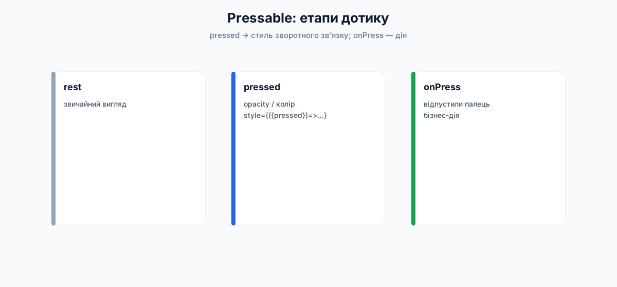
За документацією Pressable: обгортка, що відстежує стадії press на будь-якому вкладеному вмісті.
Як працює (офіційна модель)
На елементі всередині Pressable:
onPressIn— палець/курсор активував press.- Далі одне з двох:
- палець швидко прибрали →
onPressOut, потімonPress; - тримали довше за поріг (default 500 ms, див.
delayLongPress) →onLongPress, аonPressOutусе одно буде, коли палець відпустять.
- палець швидко прибрали →
Додатково:
hitSlop— розширити зону, з якої press може початися (HitRect).pressRetentionOffset— як далеко можна з’їхати пальцем, лишаючись у стані press (PressRect; default близько{ top: 20, left: 20, right: 20, bottom: 30 }).- Зона дотику не виходить за bounds батька; при перекритті сусідів важливий z-order.
<Pressable
  onPressIn={() => console.log('in')}
  onPressOut={() => console.log('out')}
  onPress={() => console.log('press')}
  onLongPress={() => console.log('long')}
  delayLongPress={500}
  hitSlop={8}
  style={({ pressed }) => [{ opacity: pressed ? 0.7 : 1 }]}
>
  <Text>Натисни</Text>
</Pressable>
Етапи press уживу
Натисніть коротко, потім утримуйте кнопку ~0.5 с — у журналі з’являться in / press / long / out.
Loading…
react-native-web · not a real device
import { useState } from 'react';
import { View, Text, Pressable, StyleSheet, useColorScheme } from 'react-native';

export default function App() {
  const [log, setLog] = useState<string[]>([]);
  const scheme = useColorScheme();
  const isDark = scheme === 'dark';
  const text = isDark ? '#f5f5f7' : '#0f172a';
  const muted = isDark ? '#a1a1aa' : '#64748b';

  const push = (msg: string) => setLog((prev) => [msg, ...prev].slice(0, 8));

  return (
    <View style={[styles.screen, isDark && { backgroundColor: '#000' }]}>
      <Text style={[styles.title, { color: text }]}>Pressable</Text>
      <Text style={{ color: muted, marginBottom: 16, fontSize: 13 }}>
        Короткий тап і long press (~500 ms)
      </Text>

      <Pressable
        onPressIn={() => push('onPressIn')}
        onPressOut={() => push('onPressOut')}
        onPress={() => push('onPress')}
        onLongPress={() => push('onLongPress')}
        delayLongPress={500}
        style={({ pressed }) => [styles.btn, pressed && styles.btnPressed]}
      >
        {({ pressed }) => (
          <Text style={styles.btnText}>{pressed ? 'Утримуєте…' : 'Натисніть / утримайте'}</Text>
        )}
      </Pressable>

      <View style={styles.logBox}>
        {log.length === 0 ? (
          <Text style={{ color: muted, fontSize: 13 }}>Події з’являться тут</Text>
        ) : (
          log.map((line, i) => (
            <Text key={`${line}-${i}`} style={[styles.logLine, { color: text }]}>
              {line}
            </Text>
          ))
        )}
      </View>
    </View>
  );
}

const styles = StyleSheet.create({
  screen: {
    flex: 1,
    backgroundColor: '#F8FAFC',
    padding: 24,
    justifyContent: 'center',
  },
  title: {
    fontSize: 24,
    fontWeight: '700',
  },
  btn: {
    backgroundColor: '#2563EB',
    paddingVertical: 16,
    borderRadius: 14,
    alignItems: 'center',
  },
  btnPressed: {
    backgroundColor: '#1D4ED8',
    transform: [{ scale: 0.98 }],
  },
  btnText: {
    color: '#fff',
    fontSize: 16,
    fontWeight: '600',
  },
  logBox: {
    marginTop: 20,
    minHeight: 140,
    gap: 4,
  },
  logLine: {
    fontSize: 13,
    fontFamily: 'monospace',
  },
});
Loading…
react-native-web · not a real device
import { useState } from 'react';
import { View, Text, Pressable, StyleSheet, useColorScheme } from 'react-native';

export default function App() {
  const [count, setCount] = useState(0);
  const scheme = useColorScheme();
  const isDark = scheme === 'dark';

  return (
    <View style={[styles.screen, isDark && { backgroundColor: '#000' }]}>
      <Text style={[styles.count, { color: isDark ? '#f5f5f7' : '#111827' }]}>{count}</Text>
      <View style={styles.row}>
        <Pressable
          onPress={() => setCount((c) => c - 1)}
          style={({ pressed }) => [styles.chip, pressed && { opacity: 0.8 }]}
        >
          <Text style={styles.chipText}>−1</Text>
        </Pressable>
        <Pressable
          onPress={() => setCount((c) => c + 1)}
          style={({ pressed }) => [styles.chip, styles.chipPrimary, pressed && { opacity: 0.8 }]}
        >
          <Text style={styles.chipText}>+1</Text>
        </Pressable>
      </View>
      <Pressable onPress={() => setCount(0)} hitSlop={12}>
        <Text style={{ color: isDark ? '#a1a1aa' : '#64748b', marginTop: 16 }}>Скинути</Text>
      </Pressable>
    </View>
  );
}

const styles = StyleSheet.create({
  screen: {
    flex: 1,
    justifyContent: 'center',
    alignItems: 'center',
    backgroundColor: '#F8FAFC',
    padding: 24,
  },
  count: {
    fontSize: 56,
    fontWeight: '700',
    marginBottom: 24,
  },
  row: {
    flexDirection: 'row',
    gap: 12,
  },
  chip: {
    backgroundColor: '#64748B',
    paddingVertical: 14,
    paddingHorizontal: 28,
    borderRadius: 14,
  },
  chipPrimary: {
    backgroundColor: '#2563EB',
  },
  chipText: {
    color: '#fff',
    fontSize: 18,
    fontWeight: '700',
  },
});
Playground: props Pressable і вигляд feedback
Один і той самий напис «Дія», але різні комбінації: disabled, стиль pressed, hitSlop (зона дотику ширша за кнопку — корисно для маленьких цілей).
Loading…
react-native-web · not a real device
import { useState } from 'react';
import { View, Text, Pressable, StyleSheet, useColorScheme } from 'react-native';

type Feedback = 'opacity' | 'scale' | 'color' | 'none';

function Chip({
  label,
  active,
  onPress,
}: {
  label: string;
  active: boolean;
  onPress: () => void;
}) {
  return (
    <Pressable onPress={onPress} style={[styles.chip, active && styles.chipOn]}>
      <Text style={[styles.chipText, active && styles.chipTextOn]}>{label}</Text>
    </Pressable>
  );
}

export default function App() {
  const [disabled, setDisabled] = useState(false);
  const [feedback, setFeedback] = useState<Feedback>('opacity');
  const [hit, setHit] = useState(0);
  const [taps, setTaps] = useState(0);
  const scheme = useColorScheme();
  const isDark = scheme === 'dark';
  const text = isDark ? '#f5f5f7' : '#0f172a';
  const muted = isDark ? '#a1a1aa' : '#64748b';

  return (
    <View style={[styles.screen, isDark && { backgroundColor: '#000' }]}>
      <Text style={[styles.h, { color: text }]}>Pressable · props</Text>
      <Text style={{ color: muted, fontSize: 13, marginBottom: 4 }}>Натискань: {taps}</Text>

      <Text style={[styles.group, { color: muted }]}>disabled</Text>
      <View style={styles.row}>
        <Chip label="false" active={!disabled} onPress={() => setDisabled(false)} />
        <Chip label="true" active={disabled} onPress={() => setDisabled(true)} />
      </View>

      <Text style={[styles.group, { color: muted }]}>style({'{ pressed }'})</Text>
      <View style={styles.row}>
        {(['opacity', 'scale', 'color', 'none'] as Feedback[]).map((f) => (
          <Chip key={f} label={f} active={feedback === f} onPress={() => setFeedback(f)} />
        ))}
      </View>

      <Text style={[styles.group, { color: muted }]}>hitSlop (розширити зону тапу)</Text>
      <View style={styles.row}>
        {[0, 12, 24].map((v) => (
          <Chip key={v} label={String(v)} active={hit === v} onPress={() => setHit(v)} />
        ))}
      </View>

      <View style={styles.stage}>
        {/* пунктир — умовна «розширена» зона hitSlop (візуальна підказка) */}
        {hit > 0 && (
          <View
            pointerEvents="none"
            style={[
              styles.hitHint,
              {
                top: -hit,
                left: -hit,
                right: -hit,
                bottom: -hit,
              },
            ]}
          />
        )}
        <Pressable
          disabled={disabled}
          hitSlop={hit}
          onPress={() => setTaps((n) => n + 1)}
          style={({ pressed }) => {
            const base = [styles.btn, disabled && styles.btnDisabled];
            if (!pressed || disabled || feedback === 'none') return base;
            if (feedback === 'opacity') return [...base, { opacity: 0.65 }];
            if (feedback === 'scale') return [...base, { transform: [{ scale: 0.96 }] }];
            if (feedback === 'color') return [...base, { backgroundColor: '#1D4ED8' }];
            return base;
          }}
        >
          <Text style={styles.btnText}>{disabled ? 'Вимкнено' : 'Дія'}</Text>
        </Pressable>
      </View>

      <Text style={[styles.code, { color: muted }]}>
        {`disabled={${disabled}}\nhitSlop={${hit}}\nfeedback: ${feedback}`}
      </Text>
      <Text style={[styles.note, { color: muted }]}>
        Пунктир навколо кнопки — лише ілюстрація hitSlop; у RN зона невидима.
      </Text>
    </View>
  );
}

const styles = StyleSheet.create({
  screen: { flex: 1, backgroundColor: '#F8FAFC', padding: 16, gap: 6 },
  h: { fontSize: 16, fontWeight: '700' },
  group: { fontSize: 11, fontWeight: '600', marginTop: 6, textTransform: 'uppercase' },
  row: { flexDirection: 'row', flexWrap: 'wrap', gap: 6 },
  chip: {
    paddingHorizontal: 10,
    paddingVertical: 6,
    borderRadius: 8,
    backgroundColor: '#e2e8f0',
  },
  chipOn: { backgroundColor: '#2563EB' },
  chipText: { fontSize: 12, fontWeight: '600', color: '#0f172a' },
  chipTextOn: { color: '#fff' },
  stage: {
    marginTop: 20,
    alignSelf: 'center',
    position: 'relative',
  },
  hitHint: {
    position: 'absolute',
    borderWidth: 1,
    borderStyle: 'dashed',
    borderColor: '#94a3b8',
    borderRadius: 18,
  },
  btn: {
    backgroundColor: '#2563EB',
    paddingVertical: 14,
    paddingHorizontal: 36,
    borderRadius: 14,
    alignItems: 'center',
  },
  btnDisabled: { backgroundColor: '#94a3b8' },
  btnText: { color: '#fff', fontSize: 16, fontWeight: '700' },
  code: { marginTop: 16, fontSize: 11, fontFamily: 'monospace', lineHeight: 16 },
  note: { fontSize: 12, lineHeight: 18 },
});
Важливі props
onPressOut у happy path).{ pressed } — головний DX Pressable.pressed (іконка/колір тексту).{ color, borderless, radius, foreground }. foreground: true — ripple поверх вкладеного вмісту (корисно з Image).onPressIn до onLongPress.Pressable побудований на внутрішньому Pressability API. Старі TouchableOpacity / TouchableHighlight у legacy-коді ще живуть; для нових екранів курсу — Pressable (як у Button і TripCard).onPress, не DOM-onClick.ScrollView — прокрутка
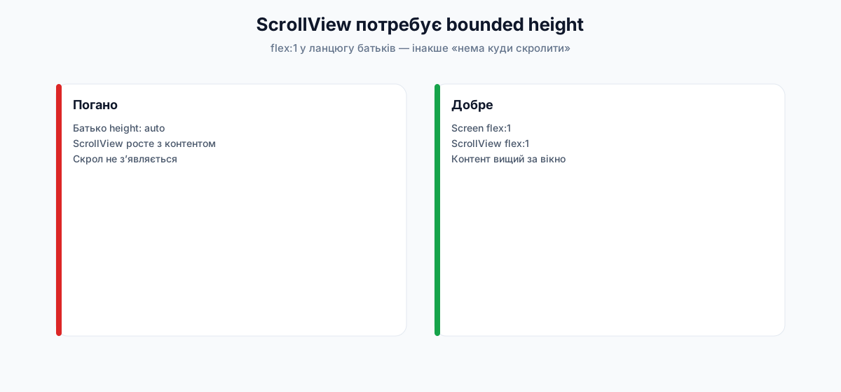
За документацією ScrollView: обгортка над platform ScrollView з інтеграцією в touch/responder-систему RN.
Критичне правило висоти
ScrollView повинен мати обмежену (bounded) висоту. Діти всередині можуть бути «вищими за екран», а сам ScrollView — ні: інакше немає куди скролити.
Типова помилка: забули flex: 1 на ланцюжку батьків (Screen → … → ScrollView). Docs радять не фіксувати height навмання, а передати bounded height зверху через flex. Інспектор елементів швидко показує, хто «з’їв» висоту.
ScrollView vs FlatList (офіційна рекомендація)
| ScrollView | FlatList | |
|---|---|---|
| Рендер вмісту | Усі одразу | Ліниво (майже видимі) |
| Пам’ять / CPU | Погано на довгих списках | Краще для довгих списків |
| Коли | Мало контенту, різнорідні блоки (форма + картки + кнопка) | Однотипні рядки, сотні елементів, separators, infinite scroll |
Для mock-стрічки з 3 поїздок ScrollView + map — нормально. Для 200 — стаття про списки.
Прокрутка вживу
Проведіть пальцем (або коліщатком миші) по прев’ю: контент вищий за екран, ScrollView має flex: 1.
Loading…
react-native-web · not a real device
import { View, Text, ScrollView, StyleSheet, useColorScheme } from 'react-native';

const items = [
  'Шапка екрана',
  'Блок з описом',
  'Картка 1',
  'Картка 2',
  'Картка 3',
  'Картка 4',
  'Кнопка внизу',
  'Ще відступ',
];

export default function App() {
  const scheme = useColorScheme();
  const isDark = scheme === 'dark';
  const text = isDark ? '#f5f5f7' : '#0f172a';
  const muted = isDark ? '#a1a1aa' : '#64748b';
  const surface = isDark ? '#1c1c1e' : '#fff';
  const border = isDark ? '#3a3a3c' : '#e2e8f0';

  return (
    <View style={[styles.root, isDark && { backgroundColor: '#000' }]}>
      <Text style={[styles.hint, { color: muted }]}>style: flex 1 · contentContainerStyle: padding</Text>
      <ScrollView
        style={styles.scroll}
        contentContainerStyle={styles.content}
        showsVerticalScrollIndicator
      >
        {items.map((label, i) => (
          <View
            key={label}
            style={[
              styles.block,
              {
                backgroundColor: surface,
                borderColor: border,
                minHeight: i === 0 ? 56 : 88,
              },
            ]}
          >
            <Text style={{ color: text, fontWeight: '600', fontSize: 16 }}>{label}</Text>
            <Text style={{ color: muted, fontSize: 13, marginTop: 4 }}>
              Блок #{i + 1} — прокрутіть до кінця
            </Text>
          </View>
        ))}
        <Text style={{ color: muted, textAlign: 'center', paddingVertical: 12 }}>· кінець ·</Text>
      </ScrollView>
    </View>
  );
}

const styles = StyleSheet.create({
  root: {
    flex: 1,
    backgroundColor: '#F8FAFC',
  },
  hint: {
    fontSize: 11,
    paddingHorizontal: 16,
    paddingTop: 12,
    paddingBottom: 8,
    fontFamily: 'monospace',
  },
  scroll: {
    flex: 1,
  },
  content: {
    padding: 16,
    paddingBottom: 32,
    gap: 10,
  },
  block: {
    borderRadius: 12,
    borderWidth: 1,
    padding: 14,
  },
});
Loading…
react-native-web · not a real device
import { View, Text, ScrollView, StyleSheet, useColorScheme } from 'react-native';

const chips = ['Усі', 'Карпати', 'Міста', 'Море', 'Закордон', 'Кемпінг', 'Фото'];

export default function App() {
  const scheme = useColorScheme();
  const isDark = scheme === 'dark';
  const text = isDark ? '#f5f5f7' : '#0f172a';

  return (
    <View style={[styles.screen, isDark && { backgroundColor: '#000' }]}>
      <Text style={[styles.title, { color: text }]}>Фільтри</Text>
      <ScrollView horizontal showsHorizontalScrollIndicator={false} contentContainerStyle={styles.row}>
        {chips.map((c, i) => (
          <View key={c} style={[styles.chip, i === 0 && styles.chipActive]}>
            <Text style={[styles.chipText, i === 0 && styles.chipTextActive]}>{c}</Text>
          </View>
        ))}
      </ScrollView>
    </View>
  );
}

const styles = StyleSheet.create({
  screen: {
    flex: 1,
    backgroundColor: '#F8FAFC',
    justifyContent: 'center',
    paddingVertical: 24,
  },
  title: {
    fontSize: 18,
    fontWeight: '700',
    marginBottom: 12,
    paddingHorizontal: 16,
  },
  row: {
    paddingHorizontal: 16,
    gap: 8,
    alignItems: 'center',
  },
  chip: {
    paddingHorizontal: 16,
    paddingVertical: 10,
    borderRadius: 20,
    backgroundColor: '#e2e8f0',
  },
  chipActive: {
    backgroundColor: '#2563EB',
  },
  chipText: {
    fontSize: 14,
    fontWeight: '600',
    color: '#0f172a',
  },
  chipTextActive: {
    color: '#fff',
  },
});
Playground: props ScrollView
Критична плутанина новачків: style (рамка скролу) vs contentContainerStyle (внутрішній контейнер вмісту). Плюс horizontal, індикатор, scrollEnabled.
Loading…
react-native-web · not a real device
import { useState } from 'react';
import {
  View,
  Text,
  ScrollView,
  Pressable,
  StyleSheet,
  useColorScheme,
} from 'react-native';

const items = ['Шапка', 'Картка 1', 'Картка 2', 'Картка 3', 'Картка 4', 'Картка 5', 'Низ'];

function Chip({
  label,
  active,
  onPress,
}: {
  label: string;
  active: boolean;
  onPress: () => void;
}) {
  return (
    <Pressable onPress={onPress} style={[styles.chip, active && styles.chipOn]}>
      <Text style={[styles.chipText, active && styles.chipTextOn]}>{label}</Text>
    </Pressable>
  );
}

export default function App() {
  const [horizontal, setHorizontal] = useState(false);
  const [indicator, setIndicator] = useState(true);
  const [enabled, setEnabled] = useState(true);
  const [contentPad, setContentPad] = useState(8);
  const [frameBg, setFrameBg] = useState(false);
  const scheme = useColorScheme();
  const isDark = scheme === 'dark';
  const text = isDark ? '#f5f5f7' : '#0f172a';
  const muted = isDark ? '#a1a1aa' : '#64748b';

  return (
    <View style={[styles.screen, isDark && { backgroundColor: '#000' }]}>
      <Text style={[styles.h, { color: text }]}>ScrollView · props</Text>

      <Text style={[styles.group, { color: muted }]}>horizontal</Text>
      <View style={styles.row}>
        <Chip label="false" active={!horizontal} onPress={() => setHorizontal(false)} />
        <Chip label="true" active={horizontal} onPress={() => setHorizontal(true)} />
      </View>

      <Text style={[styles.group, { color: muted }]}>shows*ScrollIndicator</Text>
      <View style={styles.row}>
        <Chip label="on" active={indicator} onPress={() => setIndicator(true)} />
        <Chip label="off" active={!indicator} onPress={() => setIndicator(false)} />
      </View>

      <Text style={[styles.group, { color: muted }]}>scrollEnabled</Text>
      <View style={styles.row}>
        <Chip label="true" active={enabled} onPress={() => setEnabled(true)} />
        <Chip label="false" active={!enabled} onPress={() => setEnabled(false)} />
      </View>

      <Text style={[styles.group, { color: muted }]}>contentContainerStyle.padding</Text>
      <View style={styles.row}>
        {[0, 8, 20].map((p) => (
          <Chip
            key={p}
            label={String(p)}
            active={contentPad === p}
            onPress={() => setContentPad(p)}
          />
        ))}
      </View>

      <Text style={[styles.group, { color: muted }]}>style (рамка) backgroundColor</Text>
      <View style={styles.row}>
        <Chip label="none" active={!frameBg} onPress={() => setFrameBg(false)} />
        <Chip label="amber" active={frameBg} onPress={() => setFrameBg(true)} />
      </View>

      <ScrollView
        horizontal={horizontal}
        scrollEnabled={enabled}
        showsVerticalScrollIndicator={indicator}
        showsHorizontalScrollIndicator={indicator}
        style={[
          styles.scroll,
          frameBg && { backgroundColor: '#fef3c7', borderRadius: 12 },
        ]}
        contentContainerStyle={[
          styles.content,
          horizontal && styles.contentH,
          { padding: contentPad },
        ]}
      >
        {items.map((label) => (
          <View
            key={label}
            style={[
              styles.block,
              horizontal && styles.blockH,
              { backgroundColor: isDark ? '#1c1c1e' : '#fff' },
            ]}
          >
            <Text style={{ color: text, fontWeight: '600' }}>{label}</Text>
          </View>
        ))}
      </ScrollView>

      <Text style={[styles.code, { color: muted }]}>
        {`horizontal={${horizontal}}\nscrollEnabled={${enabled}}\ncontent padding: ${contentPad}\nstyle bg: ${frameBg ? 'amber' : 'transparent'}`}
      </Text>
    </View>
  );
}

const styles = StyleSheet.create({
  screen: { flex: 1, backgroundColor: '#F8FAFC', padding: 12, gap: 4 },
  h: { fontSize: 15, fontWeight: '700' },
  group: { fontSize: 10, fontWeight: '600', marginTop: 4, textTransform: 'uppercase' },
  row: { flexDirection: 'row', flexWrap: 'wrap', gap: 5 },
  chip: {
    paddingHorizontal: 8,
    paddingVertical: 5,
    borderRadius: 8,
    backgroundColor: '#e2e8f0',
  },
  chipOn: { backgroundColor: '#2563EB' },
  chipText: { fontSize: 11, fontWeight: '600', color: '#0f172a' },
  chipTextOn: { color: '#fff' },
  scroll: {
    flex: 1,
    marginTop: 8,
    minHeight: 140,
    borderWidth: 1,
    borderColor: '#cbd5e1',
    borderRadius: 12,
  },
  content: { gap: 8 },
  contentH: { alignItems: 'center' },
  block: {
    padding: 14,
    borderRadius: 10,
    borderWidth: 1,
    borderColor: '#e2e8f0',
    minHeight: 56,
    justifyContent: 'center',
  },
  blockH: { width: 120, minHeight: 80, marginRight: 0 },
  code: { fontSize: 10, fontFamily: 'monospace', lineHeight: 14, marginTop: 4 },
});
Важливі props
style самого ScrollView (рамка скролу).scrollTo усе одно можливий).never (default) — тап поза інпутом ховає клавіатуру і вкладені елементи можуть не отримати тап.handled — якщо дитина обробила тап, клавіатура не ховається автоматом.always — клавіатура сама не ховається.Критично на формах (наступні статті).
<RefreshControl /> (лише вертикальний ScrollView). Детальніше з мережею.horizontal).nativeEvent — contentOffset, contentSize, layoutMeasurement… Часто з scrollEventThrottle (мс між подіями; ≤16 ≈ кожен кадр).Методи (через ref)
const ref = useRef<ScrollView>(null);

ref.current?.scrollTo({ x: 0, y: 0, animated: true });
ref.current?.scrollToEnd({ animated: true });
ref.current?.flashScrollIndicators();
removeClippedSubviews у docs позначений як ризикований (можливий «зниклий» контент). Не вмикати «для швидкості» без вимірювань.Safe Area — вирізи екрана
Офіційний SafeAreaView з react-native існує, але в Expo / сучасних проєктах надійніший пакет react-native-safe-area-context:
SafeAreaProvider(у дереві Router зазвичай уже є);SafeAreaViewабоuseSafeAreaInsets()→{ top, bottom, left, right }.
Навіщо: notch, Dynamic Island, home indicator, вирізи Android. Контент без inset «заїжджає» під систему.
У Nomad примітив Screen використовує SafeAreaView з цього пакета. Глибше (клавіатура + insets) — у статті про layout.
Platform — код під iOS / Android
За Platform-Specific Code є два рівні.
1. Модуль Platform (дрібні відмінності)
import { Platform, StyleSheet } from 'react-native';

// Просто перевірка
const height = Platform.OS === 'ios' ? 200 : 100;

// Вибір значення
const styles = StyleSheet.create({
  card: {
    flex: 1,
    ...Platform.select({
      ios: {
        shadowColor: '#000',
        shadowOpacity: 0.1,
        shadowRadius: 8,
        shadowOffset: { width: 0, height: 2 },
      },
      android: {
        elevation: 3,
      },
      default: {
        // web / інше
      },
    }),
  },
});
ios, android, native, default. На телефоні спочатку ios/android, інакше native, інакше default.iOS — рядок system version (напр.
"17.2"); major: parseInt(String(Platform.Version), 10).Класичний кейс UI: тіні — shadow* на iOS, elevation на Android.
У прев’ю (web) спрацює гілка default / веб-тінь; на справжньому пристрої — ios або android:
Loading…
react-native-web · not a real device
import { View, Text, Platform, StyleSheet, useColorScheme } from 'react-native';

export default function App() {
  const scheme = useColorScheme();
  const isDark = scheme === 'dark';
  const text = isDark ? '#f5f5f7' : '#0f172a';
  const muted = isDark ? '#a1a1aa' : '#64748b';

  return (
    <View style={[styles.screen, isDark && { backgroundColor: '#000' }]}>
      <View style={styles.card}>
        <Text style={[styles.title, { color: text }]}>Картка з тінню</Text>
        <Text style={{ color: muted, fontSize: 14, lineHeight: 20 }}>
          Platform.OS у цьому прев’ю: {Platform.OS}. На iOS — shadow*, на Android — elevation, інакше
          — default (легка CSS-тінь у web).
        </Text>
      </View>
    </View>
  );
}

const styles = StyleSheet.create({
  screen: {
    flex: 1,
    backgroundColor: '#F8FAFC',
    padding: 24,
    justifyContent: 'center',
  },
  card: {
    backgroundColor: '#fff',
    borderRadius: 16,
    padding: 20,
    gap: 8,
    ...Platform.select({
      ios: {
        shadowColor: '#000',
        shadowOpacity: 0.12,
        shadowRadius: 12,
        shadowOffset: { width: 0, height: 4 },
      },
      android: {
        elevation: 4,
      },
      default: {
        // web / preview
        shadowColor: '#000',
        shadowOpacity: 0.12,
        shadowRadius: 12,
        shadowOffset: { width: 0, height: 4 },
      },
    }),
  },
  title: {
    fontSize: 18,
    fontWeight: '700',
  },
});
2. Розширення файлів (великі відмінності)
BigButton.ios.tsx
BigButton.android.tsx
import BigButton from './BigButton'; // Metro обере .ios або .android
Також є .native.tsx — спільний native (iOS+Android), окремо від web-бандлера.
TripCard тінь зроблена через Platform.select у одному файлі — цього достатньо. Окремі .ios/.android файли лишайте для реально різної логіки/розмітки.Інші корисні примітиви (коротко)
ActivityIndicator
size, color, animating.StatusBar / expo-status-bar
expo-status-bar.Modal
TextInput
keyboardShouldPersistTaps).Loading…
react-native-web · not a real device
import { useState } from 'react';
import {
  View,
  Text,
  ActivityIndicator,
  Pressable,
  StyleSheet,
  useColorScheme,
} from 'react-native';

function Chip({
  label,
  active,
  onPress,
}: {
  label: string;
  active: boolean;
  onPress: () => void;
}) {
  return (
    <Pressable onPress={onPress} style={[styles.chip, active && styles.chipOn]}>
      <Text style={[styles.chipText, active && styles.chipTextOn]}>{label}</Text>
    </Pressable>
  );
}

export default function App() {
  const [size, setSize] = useState<'small' | 'large'>('large');
  const [color, setColor] = useState('#2563EB');
  const [animating, setAnimating] = useState(true);
  const scheme = useColorScheme();
  const isDark = scheme === 'dark';
  const text = isDark ? '#f5f5f7' : '#0f172a';
  const muted = isDark ? '#a1a1aa' : '#64748b';

  return (
    <View style={[styles.screen, isDark && { backgroundColor: '#111' }]}>
      <Text style={[styles.h, { color: text }]}>ActivityIndicator</Text>

      <View style={styles.row}>
        <Chip label="small" active={size === 'small'} onPress={() => setSize('small')} />
        <Chip label="large" active={size === 'large'} onPress={() => setSize('large')} />
      </View>
      <View style={styles.row}>
        <Chip label="blue" active={color === '#2563EB'} onPress={() => setColor('#2563EB')} />
        <Chip label="green" active={color === '#16A34A'} onPress={() => setColor('#16A34A')} />
        <Chip label="red" active={color === '#DC2626'} onPress={() => setColor('#DC2626')} />
      </View>
      <View style={styles.row}>
        <Chip label="animating" active={animating} onPress={() => setAnimating(true)} />
        <Chip label="stopped" active={!animating} onPress={() => setAnimating(false)} />
      </View>

      <View style={styles.stage}>
        <ActivityIndicator size={size} color={color} animating={animating} />
        <Text style={{ color: muted, marginTop: 12, fontSize: 13 }}>
          size="{size}" · animating={'{'}
          {String(animating)}
          {'}'}
        </Text>
      </View>
    </View>
  );
}

const styles = StyleSheet.create({
  screen: { flex: 1, backgroundColor: '#F8FAFC', padding: 16, gap: 8 },
  h: { fontSize: 16, fontWeight: '700' },
  row: { flexDirection: 'row', flexWrap: 'wrap', gap: 6 },
  chip: {
    paddingHorizontal: 10,
    paddingVertical: 6,
    borderRadius: 8,
    backgroundColor: '#e2e8f0',
  },
  chipOn: { backgroundColor: '#2563EB' },
  chipText: { fontSize: 12, fontWeight: '600', color: '#0f172a' },
  chipTextOn: { color: '#fff' },
  stage: { flex: 1, justifyContent: 'center', alignItems: 'center' },
});
Офіційні довідники (глибше за курс, але канон):
View · Text · Image · Pressable · ScrollView · Platform
Міні-проєкт «від А до Я»: картка товару
Цей міні-проєкт не є Nomad. Мета — один раз руками зібрати екран із базових компонентів, перш ніж переносити ту саму ідею на картку поїздки.
Мета продукту
Один екран «товар у магазині»:
- фото зверху;
- назва й ціна;
- короткий опис (обрізаний до двох рядків);
- кнопка «У кошик», яка після натискання змінює підпис на «У кошику».
Крок 1. Створити окремий проєкт
cd /path/to  # поруч: git clone https://github.com/arakviel/nomad.git
npx create-expo-app@latest product-card -t blank-typescript@sdk-54
cd product-card
Перевірити запуск:
npx expo start
Відкрити в Expo Go (SDK 54). Поки на екрані шаблонний текст — це нормально.
Крок 2. Замінити App.tsx на повний екран
Нижче — цілісний файл. Вставте його замість вмісту App.tsx у blank-шаблоні (точка входу index.ts уже реєструє App).
У реальному проєкті краще обгорнути екран у SafeAreaView з react-native (або react-native-safe-area-context у Expo Router). У лістингу нижче — SafeAreaView, щоб одразу звикати до safe area. Повний лістинг згорнуто — розгорніть, коли будете копіювати в проєкт або звірятись.
import { useState } from 'react';
import {
  Image,
  Platform,
  Pressable,
  SafeAreaView,
  ScrollView,
  StyleSheet,
  Text,
  View,
} from 'react-native';

export default function App() {
  const [inCart, setInCart] = useState(false);

  return (
    <SafeAreaView style={styles.safe}>
      <ScrollView contentContainerStyle={styles.scroll}>
        <View style={styles.card}>
          <Image
            source={{
              uri: 'https://images.unsplash.com/photo-1523275335684-37898b6baf30?w=800&q=80',
            }}
            style={styles.cover}
            resizeMode="cover"
          />

          <View style={styles.body}>
            <Text style={styles.title}>Наручний годинник Aurora</Text>
            <Text style={styles.price}>2 499 ₴</Text>
            <Text style={styles.description} numberOfLines={2}>
              Мінімалістичний дизайн, сапфірове скло, водозахист 5 ATM. Підходить для щоденного
              носіння та подорожей.
            </Text>

            <Pressable
              accessibilityRole="button"
              disabled={inCart}
              onPress={() => setInCart(true)}
              style={({ pressed }) => [
                styles.button,
                pressed && !inCart ? styles.buttonPressed : null,
                inCart ? styles.buttonDone : null,
              ]}
            >
              <Text style={styles.buttonLabel}>{inCart ? 'У кошику' : 'У кошик'}</Text>
            </Pressable>
          </View>
        </View>
      </ScrollView>
    </SafeAreaView>
  );
}

const styles = StyleSheet.create({
  safe: {
    flex: 1,
    backgroundColor: '#F8FAFC',
  },
  scroll: {
    padding: 16,
    paddingBottom: 32,
  },
  card: {
    backgroundColor: '#FFFFFF',
    borderRadius: 16,
    borderWidth: 1,
    borderColor: '#E2E8F0',
    overflow: 'hidden',
    ...Platform.select({
      ios: {
        shadowColor: '#000',
        shadowOpacity: 0.08,
        shadowRadius: 10,
        shadowOffset: { width: 0, height: 4 },
      },
      android: {
        elevation: 3,
      },
      default: {
        shadowColor: '#000',
        shadowOpacity: 0.08,
        shadowRadius: 10,
        shadowOffset: { width: 0, height: 4 },
      },
    }),
  },
  cover: {
    width: '100%',
    height: 220,
    backgroundColor: '#E2E8F0',
  },
  body: {
    padding: 16,
    gap: 8,
  },
  title: {
    fontSize: 20,
    fontWeight: '700',
    color: '#0F172A',
  },
  price: {
    fontSize: 18,
    fontWeight: '600',
    color: '#2563EB',
  },
  description: {
    fontSize: 16,
    lineHeight: 24,
    color: '#64748B',
  },
  button: {
    marginTop: 8,
    backgroundColor: '#2563EB',
    borderRadius: 12,
    paddingVertical: 12,
    alignItems: 'center',
  },
  buttonPressed: {
    backgroundColor: '#1D4ED8',
  },
  buttonDone: {
    backgroundColor: '#64748B',
  },
  buttonLabel: {
    color: '#FFFFFF',
    fontSize: 16,
    fontWeight: '600',
  },
});
Крок 3. Анатомія коду (що саме тут відбувається)
SafeAreaView
Обгортає весь екран, щоб заголовок і кнопка не залізли під системні вирізи. У blank-шаблоні ще немає вашого Screen — тому беремо SafeAreaView з react-native (для навчання достатньо; у Expo Router-проєктах частіше react-native-safe-area-context).
ScrollView + contentContainerStyle
Навіть один товар на маленькому телефоні з великим шрифтом може не вміститися. paddingBottom: 32 лишає повітря внизу.
View styles.card
«Картка» — білий прямокутник з рамкою. overflow: 'hidden' обрізає кути зображення під borderRadius батька (інакше фото лишається з гострими кутами зверху).
Image
source={{ uri: 'https://...' }} — картинка з мережі (потрібен інтернет).style.cover задає width + height — без цього Image часто не видно.resizeMode="cover" заповнює рамку 100% × 220.
Text для назви, ціни, опису
Жодного рядка поза Text.numberOfLines={2} на описі: довгий текст обрізається, картка не роздувається.
useState + Pressable
inCart зберігає, чи товар «додано».onPress виставляє true.disabled={inCart} блокує повторні натискання.
Підпис кнопки залежить від стану: «У кошик» / «У кошику».style як функція від { pressed } затемнює кнопку під час дотику.
Platform.select у тіні
На iOS — shadow*, на Android — elevation. Один об’єкт стилю card отримує потрібний набір полів через spread ...Platform.select(...).
Крок 4. Перевірка на пристрої
- Зберегти
App.tsx, дочекатися Fast Refresh. - Побачити фото, назву, ціну, опис, кнопку.
- Натиснути «У кошик» → текст стає «У кошику», кнопка сірішає.
- Прокрутити (якщо екран низький) — низ не обрізаний «намертво».
Критерій «готово»
- Немає «голого» тексту в
View. - У
Imageє ширина й висота. onPressзмінює UI (не лишеconsole.log, хоча лог теж можна додати).- Safe area не «з’їдає» контент під вирізом.
- Ієрархія:
SafeAreaView→ScrollView→View(картка) →Image+ тексти +Pressable. resizeMode="cover".- Тінь через
Platform.select. - Українські підписи.
- Друге натискання на кнопку нічого не ламає (
disabled).
@/, tokens і feature-папок — щоб зосередитися на примітивах RN. У Nomad нижче ті самі ідеї з’являться вже в структурі курсу.Живе прев’ю (після кроків)
Коли код уже зрозумілий — можна покрутити той самий екран у браузері (react-native-web, не Expo Go). Натисніть «У кошик» — підпис і колір кнопки зміняться. У прев’ю корінь — View замість SafeAreaView (у web safe area майже не відчутна).
Loading…
react-native-web · not a real device
import { useState } from 'react';
import {
  Image,
  Platform,
  Pressable,
  ScrollView,
  StyleSheet,
  Text,
  View,
} from 'react-native';

export default function App() {
  const [inCart, setInCart] = useState(false);

  return (
    <View style={styles.safe}>
      <ScrollView contentContainerStyle={styles.scroll}>
        <View style={styles.card}>
          <Image
            source={{
              uri: 'https://images.unsplash.com/photo-1523275335684-37898b6baf30?w=800&q=80',
            }}
            style={styles.cover}
            resizeMode="cover"
          />

          <View style={styles.body}>
            <Text style={styles.title}>Наручний годинник Aurora</Text>
            <Text style={styles.price}>2 499 ₴</Text>
            <Text style={styles.description} numberOfLines={2}>
              Мінімалістичний дизайн, сапфірове скло, водозахист 5 ATM. Підходить для щоденного
              носіння та подорожей.
            </Text>

            <Pressable
              accessibilityRole="button"
              disabled={inCart}
              onPress={() => setInCart(true)}
              style={({ pressed }) => [
                styles.button,
                pressed && !inCart ? styles.buttonPressed : null,
                inCart ? styles.buttonDone : null,
              ]}
            >
              <Text style={styles.buttonLabel}>{inCart ? 'У кошику' : 'У кошик'}</Text>
            </Pressable>
          </View>
        </View>
      </ScrollView>
    </View>
  );
}

const styles = StyleSheet.create({
  safe: {
    flex: 1,
    backgroundColor: '#F8FAFC',
  },
  scroll: {
    padding: 16,
    paddingBottom: 32,
  },
  card: {
    backgroundColor: '#FFFFFF',
    borderRadius: 16,
    borderWidth: 1,
    borderColor: '#E2E8F0',
    overflow: 'hidden',
    ...Platform.select({
      ios: {
        shadowColor: '#000',
        shadowOpacity: 0.08,
        shadowRadius: 10,
        shadowOffset: { width: 0, height: 4 },
      },
      android: {
        elevation: 3,
      },
      default: {
        shadowColor: '#000',
        shadowOpacity: 0.08,
        shadowRadius: 10,
        shadowOffset: { width: 0, height: 4 },
      },
    }),
  },
  cover: {
    width: '100%',
    height: 220,
    backgroundColor: '#E2E8F0',
  },
  body: {
    padding: 16,
    gap: 8,
  },
  title: {
    fontSize: 20,
    fontWeight: '700',
    color: '#0F172A',
  },
  price: {
    fontSize: 18,
    fontWeight: '600',
    color: '#2563EB',
  },
  description: {
    fontSize: 16,
    lineHeight: 24,
    color: '#64748B',
  },
  button: {
    marginTop: 8,
    backgroundColor: '#2563EB',
    borderRadius: 12,
    paddingVertical: 12,
    alignItems: 'center',
  },
  buttonPressed: {
    backgroundColor: '#1D4ED8',
  },
  buttonDone: {
    backgroundColor: '#64748B',
  },
  buttonLabel: {
    color: '#FFFFFF',
    fontSize: 16,
    fontWeight: '600',
  },
});
Nomad: mock-картки поїздок
Навіщо користувачу
Користувачу потрібна стрічка поїздок, а не порожній екран. Поки без мережі — mock-дані й картки, зібрані з базових компонентів React Native.
Нитка проєкту
Уже є (з попередніх статей — не викидаємо):
- Структура
app/+src/shared(токени, Screen / AppText / Button). - Домашній екран-заглушка на примітивах.
Додаємо в цій статті:
- Фіча
src/features/trips: типи,mockTrips,TripCard. - Картка на core-компонентах:
View,Text/AppText,Image,Pressable. - Стрічка з кількох mock-поїздок на home (
mapу контейнері).
Повний знімок проєкту після цієї статті
git pull у клоні репо. Нижче — весь проєкт на момент цієї статті (усі файли з кодом), не фрагмент «лише нові папки». Клік по файлу в дереві → повний вміст для копіпасту.cd /path/to/nomad
git pull
npm install
npx expo start
Перевірка
- На home видно кілька карток з обкладинкою, назвою, датами.
- Натискання картки пише в консоль
TODO: відкрити поїздку. - Немає «голого» тексту поза
Text/AppText.
Коміт
Якщо збирали вручну (не через git pull на вже запушений репо):
cd /path/to/nomad
git add -A
git commit -m "$(cat <<'EOF'
feat: mock trip cards with core RN components

Material: content/15.react-native/06.core-components.md
EOF
)"
git push
У публічному репо цей коміт уже є — після git pull повторно комітити не потрібно, якщо ви не змінювали код локально.
Результат (прев’ю)
Loading…
react-native-web · not a real device
import { useState } from 'react';
import {
  Image,
  Platform,
  Pressable,
  ScrollView,
  StyleSheet,
  Text,
  View,
} from 'react-native';

type Trip = {
  id: string;
  title: string;
  dateLabel: string;
  description: string;
  coverUri: string;
};

const mockTrips: Trip[] = [
  {
    id: '1',
    title: 'Карпати на вихідні',
    dateLabel: '12–14 бер. 2026',
    description: 'Говерла, полонини й вечірній чай біля каміну в котеджі.',
    coverUri: 'https://images.unsplash.com/photo-1464822759023-fed622ff2c3b?w=800&q=80',
  },
  {
    id: '2',
    title: 'Львівський вікенд',
    dateLabel: '2–4 трав. 2026',
    description: 'Кава, площа Ринок, закапелки й нічний трамвай.',
    coverUri: 'https://images.unsplash.com/photo-1555881400-74d7acaacd8b?w=800&q=80',
  },
  {
    id: '3',
    title: 'Одеса біля моря',
    dateLabel: '18–22 лип. 2026',
    description: 'Схід сонця на набережній, рибний ринок і вечірній Привоз.',
    coverUri: 'https://images.unsplash.com/photo-1507525428034-b723cf961d3e?w=800&q=80',
  },
];

function TripCard({ trip, onPress }: { trip: Trip; onPress?: (t: Trip) => void }) {
  return (
    <Pressable
      accessibilityRole="button"
      accessibilityLabel={`Поїздка ${trip.title}`}
      onPress={() => onPress?.(trip)}
      style={({ pressed }) => [styles.card, pressed && styles.cardPressed]}
    >
      <Image source={{ uri: trip.coverUri }} style={styles.cover} resizeMode="cover" />
      <View style={styles.cardBody}>
        <Text style={styles.cardTitle} numberOfLines={1}>
          {trip.title}
        </Text>
        <Text style={styles.cardDates}>{trip.dateLabel}</Text>
        <Text style={styles.cardDesc} numberOfLines={2}>
          {trip.description}
        </Text>
        <Text style={styles.cardLink}>Відкрити</Text>
      </View>
    </Pressable>
  );
}

export default function App() {
  const [last, setLast] = useState('Оберіть поїздку');

  return (
    <View style={styles.screen}>
      <ScrollView contentContainerStyle={styles.scroll} showsVerticalScrollIndicator={false}>
        <Text style={styles.title}>Мандрівник</Text>
        <Text style={styles.caption}>Щоденник подорожей</Text>
        <Text style={styles.section}>Ваші поїздки</Text>

        {mockTrips.map((trip) => (
          <TripCard
            key={trip.id}
            trip={trip}
            onPress={(t) => setLast(`TODO: відкрити «${t.title}»`)}
          />
        ))}

        <Pressable
          style={({ pressed }) => [styles.cta, pressed && { backgroundColor: '#1D4ED8' }]}
          onPress={() => setLast('TODO: нова поїздка')}
        >
          <Text style={styles.ctaLabel}>Нова поїздка</Text>
        </Pressable>

        <Text style={styles.log}>{last}</Text>
      </ScrollView>
    </View>
  );
}

const styles = StyleSheet.create({
  screen: {
    flex: 1,
    backgroundColor: '#F8FAFC',
  },
  scroll: {
    padding: 16,
    paddingBottom: 40,
  },
  title: {
    fontSize: 28,
    fontWeight: '700',
    color: '#0F172A',
  },
  caption: {
    fontSize: 14,
    color: '#64748B',
    marginTop: 4,
    marginBottom: 20,
  },
  section: {
    fontSize: 16,
    fontWeight: '600',
    color: '#0F172A',
    marginBottom: 12,
  },
  card: {
    backgroundColor: '#FFFFFF',
    borderRadius: 16,
    borderWidth: 1,
    borderColor: '#E2E8F0',
    overflow: 'hidden',
    marginBottom: 16,
    ...Platform.select({
      ios: {
        shadowColor: '#000',
        shadowOpacity: 0.08,
        shadowRadius: 10,
        shadowOffset: { width: 0, height: 4 },
      },
      android: { elevation: 3 },
      default: {
        shadowColor: '#000',
        shadowOpacity: 0.08,
        shadowRadius: 10,
        shadowOffset: { width: 0, height: 4 },
      },
    }),
  },
  cardPressed: {
    opacity: 0.92,
  },
  cover: {
    width: '100%',
    height: 140,
    backgroundColor: '#E2E8F0',
  },
  cardBody: {
    padding: 14,
    gap: 4,
  },
  cardTitle: {
    fontSize: 18,
    fontWeight: '600',
    color: '#0F172A',
  },
  cardDates: {
    fontSize: 13,
    color: '#64748B',
  },
  cardDesc: {
    fontSize: 15,
    lineHeight: 22,
    color: '#64748B',
    marginTop: 4,
  },
  cardLink: {
    marginTop: 8,
    fontSize: 13,
    fontWeight: '600',
    color: '#2563EB',
  },
  cta: {
    backgroundColor: '#2563EB',
    borderRadius: 12,
    paddingVertical: 14,
    alignItems: 'center',
    marginTop: 4,
  },
  ctaLabel: {
    color: '#fff',
    fontSize: 16,
    fontWeight: '600',
  },
  log: {
    marginTop: 14,
    fontSize: 12,
    color: '#64748B',
    fontFamily: 'monospace',
  },
});
Підсумок
View — коробка layout без «голого» тексту
Text / AppText — усе, що читають (вкладеність, numberOfLines)
Image — source + явні розміри + resizeMode
Pressable — onPress / onLongPress, не onClick
ScrollView — мало контенту; багато рядків — пізніше FlatList
Safe area — не лізти під системні вирізи
Platform — дрібні відмінності (тіні, відступи)
Зібрати картку — product-card + mock TripCard у Nomad
Playground-и props — крутити значення й дивитися на UI
У статті є інтерактивні playground (чіпи зі значеннями props): View style, Text (lines/ellipsis + style), Image (resizeMode/blur/height), Pressable (disabled/feedback/hitSlop), ScrollView (horizontal/content padding/style), ActivityIndicator. Усі — через ::react-native-preview (react-native-web). Для фінальної перевірки жестів, safe area й нативних тіней запустіть той самий код у Expo Go або симуляторі.
Далі — Flexbox і layout у React Native: flexDirection за замовчуванням column, вирівнювання, gap, клавіатура.
Практичні завдання
Базовий рівень
- Пояснити, чому рядок не кладуть прямо в
View. - Зібрати картку з
Image+ двохText+Pressable. - Увімкнути
numberOfLines={2}на довгому описі.
Середній рівень
- Зібрати mock-стрічку з 3+
TripCardу Nomad. - Додати тінь картки через
Platform.select. - Обгорнути довгий екран у
ScrollViewзcontentContainerStylepadding знизу.
Професійний рівень
- Зробити
TripCardз пропсами TypeScript (title,dateLabel,coverUri,onPress). - Додати стан «обрана картка» (підсвітка бордера) через
Pressable/ стан у батьку. - Порівняти (абзац)
ScrollViewі майбутнійFlatListдля 200 поїздок.
Часті запитання
style, немає мережі, або HTTP заблоковано політикою (на Android для cleartext потрібні окремі налаштування — для навчання краще https://).onPress. Обгортки, які емулюють web-події, у курс не входимо.AppText — домовленість проєкту на базі Text. Без розуміння Text важко дебажити обрізання, доступність і вкладені стилі.Структура проєкту та перші UI-примітиви
Як організувати Expo-проєкт для зростання — папки app і src, design tokens, Screen, AppText, Button, платформні файли
Flexbox і layout у React Native
Колонка за замовчуванням, осі, align/justify, flex і gap, safe area, клавіатура — і п’ять типових екранів для мобільної верстки